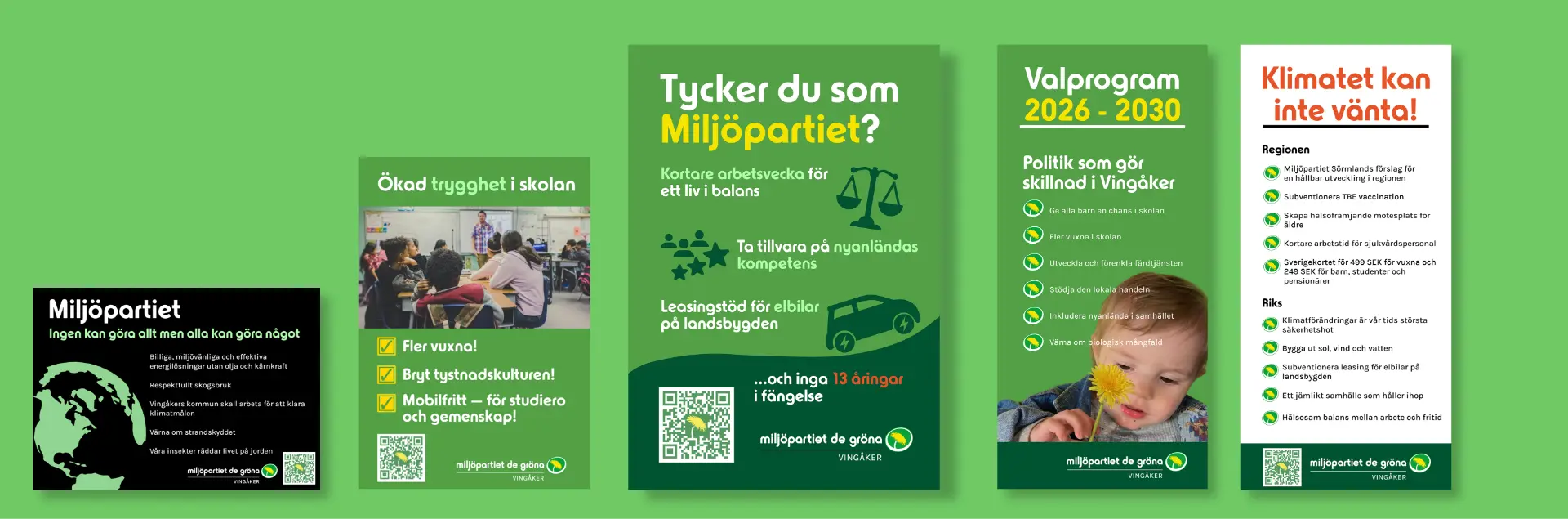
Miljöpartiet
Designing graphics for posters, brochures, and newspaper ads for a local political campaign.
I helped Miljöpartiet Vingåker update their visual design to be in line with Miljöpartiet’s design system, and created designs based on four different briefs over the summer of 2026.
01 / Briefs
I was asked to create five graphics for Miljöpartiet Vingåker’s political campaign. Here are the two examples expanded upon in this case study:
- A local newspaper ad showing their political opinions
- A brochure that shows their upcoming election program
Each brief featured a detailed discussion with the local political leaders of Miljöpartiet, who collectively decided on the text for the designs but let me alone create the visuals.
In my research before taking on this project I found the online document that Miljöpartiet provides to all local parties in which all details regarding the use of their graphics, typography, colors etc. were listed. This introduced the additional challenge of designing not only for my clients at the local party but balancing this with the style guide from the main party, which the local party is required to follow.
The style guide helped immensely in creating professional, and coherent graphics.
02 / Background
The process for each of the items was a back and forth between sketching, validating and reviewing. With the style guide, the clients wishes and general design rules, the result was that the designs were actually very quick and fun to create. In a robust system, creating content is not actually that difficult. Sometimes these stakeholders do contradict each other which leads to having to balance multiple wishes.
Before I started the first of the posters I did look at some of the competition for the local party, so I could see in which way my design could pop, and stand out.
Here are the previous versions of their newspaper ad, and one competitor’s:
I must admit that my confidence in my ability to improve the current graphic design was quite high at this point. Based on these graphics, and a reading of the local newspaper I recognized the need for a more modern design, with clearer hierarchy, bolder colors and better contrast.
I could spend some time digging into the possible improvements of the previous design, but I would rather advocate for why my design is good, than why another is bad.
03 / Newspaper Ad
I chose to use the recommended colors and font from the style guide. I believe the biggest improvement is the scannability, where my design features highlights for important parts of the text. The contrast improved because of the color choices, and the red text for “13 åringar” was selected to signal the political “red line” regarding that issue. My ambition was to give the ad some breathiness as to allow the colors to pop more.
The local party liked it so much that they later used the design for a political poster as well.
A direct (translated) quote from the local party upon seeing the design:
“It’s amazing! I saw it immediately, it’s very visible, fresh, fun and spirited. It sets us apart, well done, now we will be seen!”
04 / Brochure
I was asked to create a new brochure for the 2026 - 2030 election program. This was to be more informational, and included a front and backside. For this graphic I was requested to include a baby holding a dandelion, which I must admit was not the easiest to get a hold of. A look behind the scenes will reveal that the baby is actually holding a phone, but this has been digitally replaced with a dandelion, which I believe was the right choice considering their politics.
I was given the last elections program brochure, which was informative regarding the density of information, but also showed some areas of improvement in the design language. The most obvious missing elements from most of the local party’s graphics is the lack of headers and clear messaging, which was something I advocated for in the design process of all their graphics. It was very important for the local party that the density of information was kept, as they felt that they had a lot to say, so I did my best to make the typography spaced out and readable without feeling like a novel.
My design introduces headers and sections which clearly guides the reader to the most relevant information for them. The main points of the party were clearly displayed on the front, while the more specific information was presented on the back. I chose to again use highlighting colors, opting for red to signal the importance and criticality of the message “The climate cannot wait!”.

05 / Conclusion
This project taught me a lot about visual design, how to follow a style guide and how appreciated and important design actually is to have a message stand out from the masses. A surprising aspect was how much the work of a designer includes communicating with clients regarding why certain choices are better from a design perspective, and that sometimes compromises need to be made.
My previous ideas regarding what a political ad is was also challenged, as I believed previously that punchy, simple and striking was the most important aspects, since most people skim through these papers, but this was the perspective of a young person from Stockholm. It was clear when analyzing the content of the specific newspaper that the ad was going to be published in that the audience was older people in a small town, of course also susceptible to striking and good design, but perhaps more prone to want more text and to actually read the entire thing.
The main takeaways from this project are the following:
- Communicating with stakeholders is half of the job
- It feels really good to get a nice response to creative work
- Creating style guides and design systems is extremely valuable for large organisations to speed up processes, but there’s still room for a personal touch in each piece of content
- Graphic design is not so different from UX Design, as understanding how to communicate to the user is the goal of both fields.